SoYummy
Vision for the economy of abundance
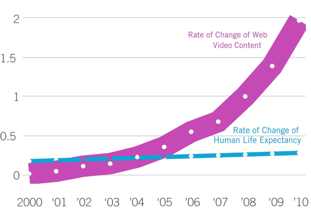
This project encompasses lecture performances, visualizations, and research and is created in collaboration with Yogesh Girdhar. We developed software to wrangle media abundance using visualizations and computer vision software originally developed at McGill's robotics department. The lecture performance employs machine learning live to confront the looming challenges of media overload. We show how the artistic and curatorial classification complex can be alleviated by restating the issue as a vision problem. Through this entertaining multi-media presentation, we hope to engage the audience in pondering strategies for keeping our heads above water in a deluge of data. We invite you to read our paper published in the Parsons Journal of Information Mapping at the New School of Social Research, freely available as a PDF.
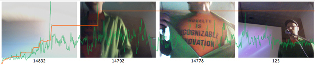
The lecture performance features live curiosity software demonstrations. A camera's video stream is processed by the software and the results are visualized on the screen in real time. Audience members are invited to try to interest the software by performing in front of the camera.
Performances and demonstrations have been given at Marymount California University in Los Angeles CA, Wellesley College in Boston MA, Spark Video in Syracuse NY, McGill University in Montreal, and the Subtle Technologies conference in Toronto. Video works generated with the help of the software were screened in the US and Germany.
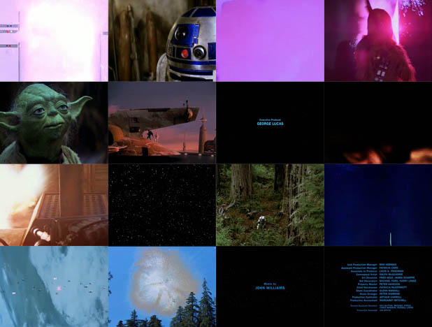
Above are 16 summary stills of the Star Wars Trilogy chosen by the summarization software. Do these images match your idea of the most memorable moments from that movie? Can you imagine what the machine was thinking when it chose these?
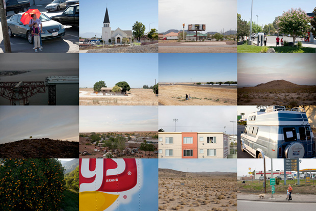
Now that you have an idea of how the machine thinks, take a look at these automatically selected photos. These were mined from a data pool of hundreds of images taken by photographer Jay Muhlin on a cross-country semi-trailer truck hitch-hiking trip. Do you get a good sense of the ground covered?
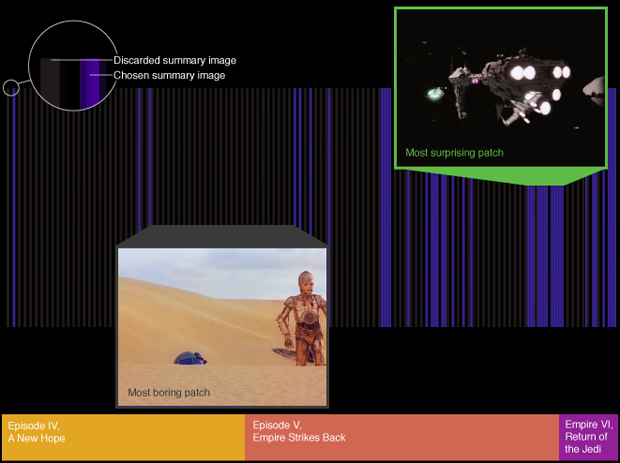
Video is evaluated by the software live. It continually keeps a selection of the most curious stills. As new content is encountered, the software may become surprised. To make room for this new surprising image, the machine has to decide which image to throw away.
Above is a one minute video summary of Citizen Kane. At first this software did a good job only with movies by directors that closely tie the meaning to the visual economy. Another example of a one minute summary (for the movie Fear and Loathing in Las Vegas) can be found here. The software became good for summarizing films by other directors with the addition of audio analysis, subtitle analysis, facial recognition, and topic modeling.
 The Wizard of Oz Similarity Explorer
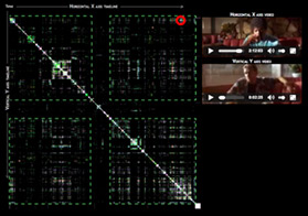 Pulp Fiction Similarity Explorer
Cinema has been compared to the animal genome in several productive ways. Biologist and educator Gabriel A. Harp suggests that analytical approaches from one of the fields can be applied to the other. Our analytics software discovers ideas within a video using computer vision (including color, texture, blob, and face detection), sound, and spoken word analysis and then uses this topic model to represent similarity between frames in the movie with pixels of varied brightness and color. We used a similarity diagram to visualize and explore patterns in films such as The Wizard of Oz and Pulp Fiction.
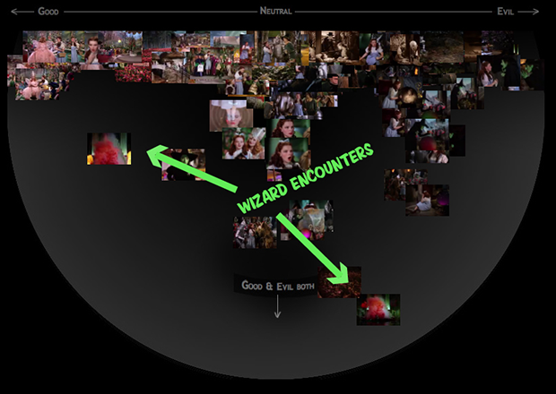
Our analytics software detected several ideas within the Wizard of Oz such as Good (good witch, munchkins) and Evil (bad witch, kidnappings). Curiously, scenes of encounters with the Wizard appeared to contain both good and evil. This analysis led us to reexamine the Wizard as a liminal character who at first appears scary and bad (he instructs Dorothy to kill the bad witch) and is finally unmasked as a sort of bumbling but benign man behind the curtain who actually wanted to help.
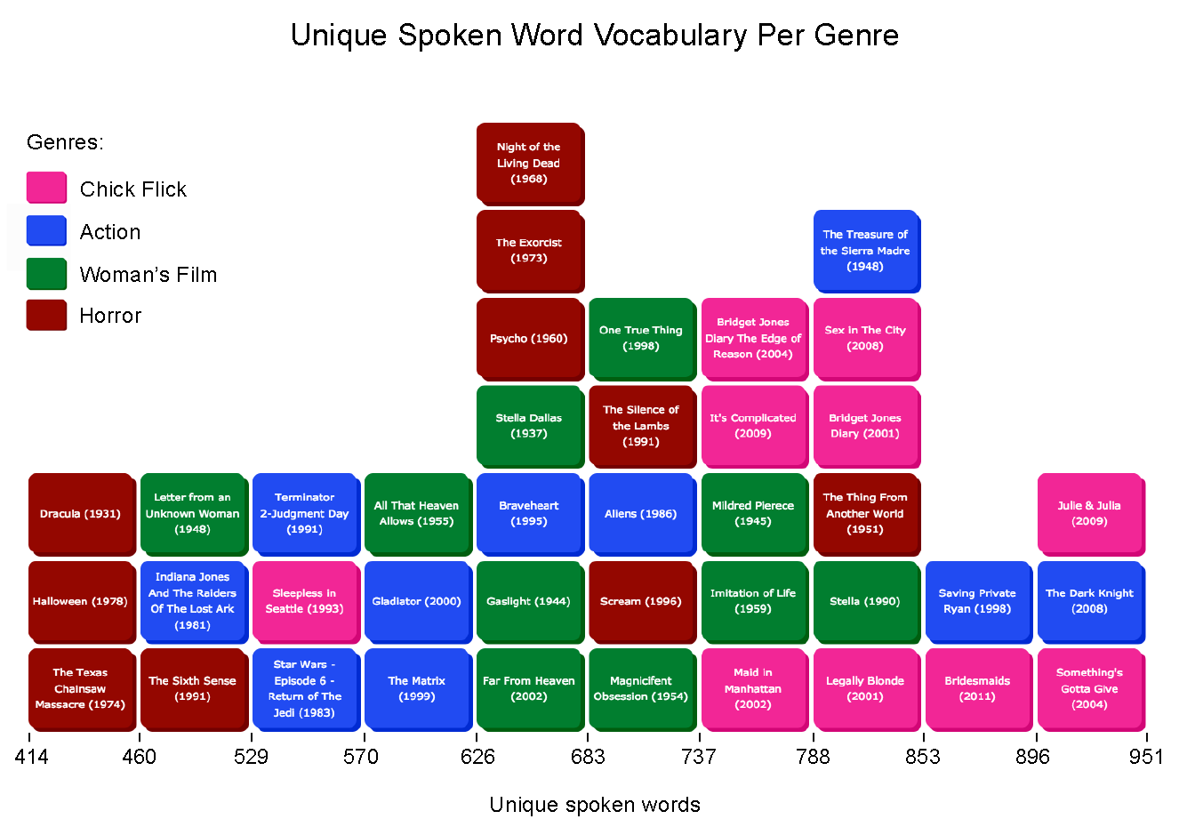
Film criticism often focuses on genre-based analysis so we decided to topic model genres. We looked at four genres including Action as defined by IMDB, Horror as defined by Kendall Phillips, and Chick Flicks and Woman's Films as defined by Karen Hollinger in her book Feminist Film Studies (pages 35–66, pdf). We counted the amount of unique stem words that were spoken in forty films using ten films per genre. We then visualized this information using a unique color for each genre. What this graphic shows is that Chick Flicks have the highest vocabularies. Movies in this genre are dialog heavy and hence have a higher chance of having wide-ranging vocabularies of spoken words. It seems that Woman's Films employ a wider range of techniques to activate their audience, suggesting a more complex and deeper genre. Horror films rely on music and pacing to achieve their affect and hence have the smallest vocabularies.
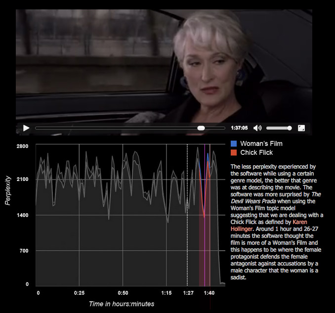
Is The Devil Wears Prada a mere formulaic Chick Flick or does it go beyond and qualify as a Woman's Film? The graph shows that the software was more surprised by the movie when using the Woman's Film topic model suggesting that we are dealing with a Chick Flick. A little bit before one hour and twenty seven minutes in, the software thought of the film as more of a Woman's Film and this happens to be where the female protagonist defends the female antagonist against accusations by a male character that the woman is a sadist. Play with this Google Chrome interactive visualization here.